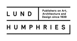
Introducing the new Lund Humphries identity
Lund Humphries is celebrating two years as an independent publisher following our departure from the Ashgate Publishing Group in Summer 2015. It has been an exciting time of change and growth as we expand into new subject areas, particularly architecture and design. In line with this change, we have created a new visual identity to reflect our position as a 21st-century publisher of illustrated books, with a heritage dating back to 1939.
We are delighted to have had designer Harry Woodrow, and his company Multistorey, lead the creative design for this project. Here we share a bit of the research Harry conducted into our archives and the reasoning behind the new brand visuals and logos we agreed upon.
Lund Humphries Archives
Harry Woodrow was inspired by key books from the Lund Humphries catalogue, along with these poster designs by Edward McKnight Kauffer, Lund Humphries’s first design director, which use very condensed, specially drawn letter forms. Some have quite peculiar details, contrasting curved forms with blunter, squarer shapes.


Introducing the new logo family

Top left: The main Lund Humphries logo which will be used for most applications.
Bottom left: The Lund Humphries lock-up logo which includes a description of what Lund Humphries does.
Right: This is the Lund Humphries spine logo. It is the only logo to be used on the spine of the books, and can be used for certain rare applications where a vertical logo would be visually more appropriate.
Website
We’ve rolled the new identity out across our website and on social media. Please take a look and follow us on facebook, twitter, instagram and pinterest.
We’d love to hear your thoughts on this new identity and our relatively new website. The website has been up and running since we went independent and we’re looking to make changes to make it as user-friendly as possible. Please email us at info@lundhumphries.com and tell us what you think.

