

Johnston & Gill: Very British Types
We’re delighted to present the latest book by transport design historian Mark Ovenden: Johnston and Gill: Very British Types, available now (HB, £40), coincides with the centenary of Johnston and the 90th anniversary of Gill Sans. This book celebrates their significant contribution to Britain’s visual culture.
Edward Johnston (1872–1944) and Eric Gill (1882–1940) were originators of two of the world’s most enduring typefaces. Johnston still stands as London’s primary ‘wayfinding’ lettering, most notably on the London Underground, while Gill Sans is the type of choice within many public and private organisations across the UK today, including the BBC and John Lewis.
Both faces are still widely used and have been revised many times – most recently Monotype’s Gill Sans Nova series in 2015 and Johnston100, designed to commemorate Johnston’s centenary this year. Gill’s sans became so ubiquitous that along with Johnston’s London lettering, the two styles dominated the British landscape, inspiring Jock Kinneir and Margaret Calvert’s sans serif alphabets and typographers worldwide to this day.
Below are a few of our favourite images from the book.

Above: Lund Humphries was an early adopter of Gill Sans Titling capitals. This is a type-specimen cover of 1929.

Above: Paddington station, photographed in 1955, with Underground Signage in Johnston and British Railways architrave lettering in Gill Sans. New signs featuring both Johnston and BR’s Gill Sans were commonplace at shared stations in London. Image from collection of the author Mark Ovenden.

Above
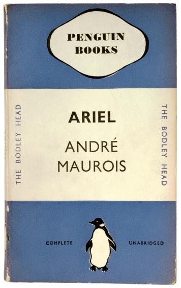
Above: The very first title published in 1935 under the new Penguin Books imprint, featuring the iconic cover of Gill Sans lettering for all but the publisher’s name in the top cartouche.
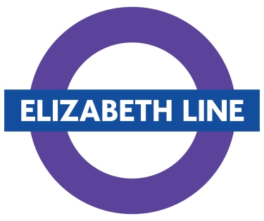
Above: Crossrail was renamed the Elizabeth line in 2016. Due to open in 2018, it will feature Johnston100 throughout.

Above: The first time the Johnston letters appeared on any Royal Mint coinage was in 2013 on two £2 coins (still in general circulation), commemorating the 150th anniversary of the Underground. Image courtesy of Royal Mint.

Above: image courtesy of the author Mark Ovenden.
Have you seen any great signs you’d like to share? Tweet your favourite examples of Johnston typeface with Mark and his followers on twitter now.
Buy your copy of Johnston & Gill: Very British Types on our site here.